
Your coaching website is the first real conversation you have with a potential client, except you’re not in the room for it. They land, they scroll, and within a few seconds they decide whether you’re the coach who can help them or just another pretty homepage.
What actually makes one coaching website book clients while another gets a polite scroll and a closed tab? We wanted a real answer, not a hunch.
So we reviewed 19 real coaching websites and scored each one against a simple six-point checklist: clarity, booking path, social proof, pricing, email capture, and personality. A few of the findings surprised us. Not one of the 19 showed a price anywhere on the homepage. Only 9 of them gave you an obvious way to book a call up top. And the sites that felt instantly trustworthy almost always nailed the same short list of things.
In this guide, you’ll get the scorecard we used (so you can grade your own site), 9 coaching websites worth studying, a look at the best website builder for coaches (WordPress vs. Squarespace vs. Showit vs. Paperbell), the pages every coaching site needs, and the fastest way to build yours without touching a single line of code. Let’s dig in.
Heads up: some links in this article are affiliate links, which means Paperbell may earn a commission if you buy through them, at no extra cost to you.
What Actually Makes a Coaching Website Work
Before we look at examples, here’s the lens we used to judge them, and the same one you can use on your own site.
When we reviewed those 19 coaching websites, we weren’t grading them on how pretty they looked. Pretty is easy. We were grading on whether the site did its job: help the right person understand what you offer and take the next step. That comes down to six things.
The 6-Point Coaching Website Scorecard
Open your own homepage in another tab and score yourself on each of these. Anything you’d rate a 1 is a to-do list for the weekend.
| What we checked | What good looks like |
|---|---|
| 1. Clarity of who it’s for | Within seconds, a visitor knows who you help and what changes for them. A specific audience or a real outcome in the headline, not a poetic line that could belong to anyone. |
| 2. A visible path to book or buy | One obvious next step for a ready visitor: book a call, apply, schedule, or buy. Not just a soft “contact” link buried in the menu. |
| 3. Social proof | Testimonials, named client results, an “as featured in” strip, or follower counts, right there on the page that’s doing the selling. |
| 4. Service and pricing transparency | Offers laid out as clear, named packages with context. Whether you show a price or gate it behind a call, visitors should understand what you actually sell. |
| 5. Email capture with a reason | A way to stay in touch with someone who isn’t ready yet, ideally a specific free asset (an assessment, a short audio, a masterclass) rather than a bare “subscribe” box. |
| 6. Personality and differentiation | A distinct voice, a named method, or a clear niche that separates you from every other coach with a nice template. |
What Separated the Best From the Rest
Here’s what the scoring pass turned up across the 19 sites. The patterns are worth more than any single example.
All 19 sites had a working mobile layout. That’s the baseline now, not a selling point, and skipping it loses you visitors you’ll never even hear about.
The strongest sites lead with who it’s for. Only 8 of the 19 opened with a genuinely clear audience-and-outcome headline. Most coaches are burying their best asset under something vague.
Email capture was universal. Every one of the 19 sites had some kind of signup box, but only 9 attached it to a specific freebie instead of a bare “Join my newsletter” form.
Social proof is all over the map. 7 of the 19 put real proof above the fold; 5 showed none at all on the homepage. If you’ve got results, that’s where they need to live.
A direct booking button turned out to be rarer than we expected. Only 9 of the 19 surfaced a book-a-call, apply, or schedule button up top, and the other 10 routed people through softer pages first, adding friction for someone who was already ready to say yes.
Nobody shows a price. Zero of the 19 displayed actual coaching-package pricing on the homepage. That’s a deliberate choice for high-ticket coaches. If you’re lower-ticket or self-serve though, a visible price might be exactly what gets a fence-sitter to book.
9 Real Life Coaching Websites Worth Studying
If you’d rather build your own site from scratch, it’s worth studying what works. The best life coaching websites combine engaging visuals, clear branding, easy navigation, and copy that speaks to one specific person.
Here are some great examples to inspire your design and content choices. As you read each one, notice which scorecard points it wins on.
A quick note on how these fit together: our 19-site scoring pass shaped the scorecard above and four of the entries below (Rich Litvin, Hello Seven, Amy Porterfield, and Selena Soo), while our longstanding gallery favorites were re-verified this month to make sure they still hold up.
1. Preston Smiles
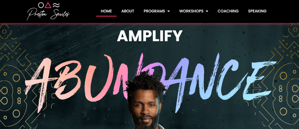
Preston Smiles establishes a personal connection and credibility early on. He does this with branded images of himself, an “as seen in” strip, and a short bio, all placed high on the homepage. That’s a clean win on social proof and personality.
2. Cortney McDermott
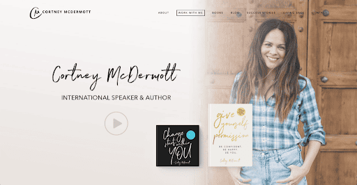
Cortney McDermott‘s site is simple and intuitive, and it pulls you in the second you land on it.
The navigation feels effortless, her branding video quickly shows she’s an engaging speaker, and the list of organizations below backs up her expertise.
Videos like this (an “About me” clip or an explainer) also help keep people on the page longer, which helps your search engine optimization (SEO), since it signals to Google that visitors are more interested in your site than your competitors’.
3. Stratejoy
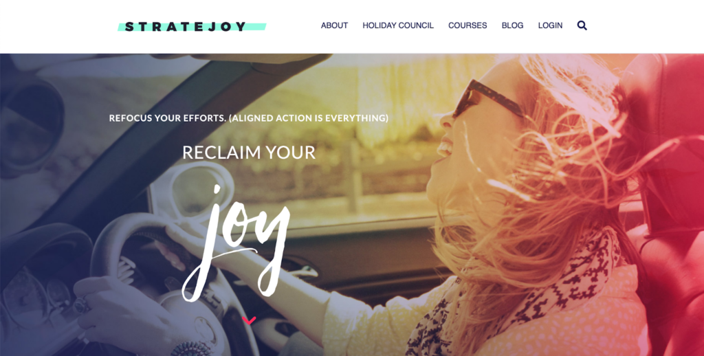
With Stratejoy, Molly Mahar takes a clever approach by building on community and togetherness. Reading her website makes you feel like you’re about to join an awesome group of women on their journey.
Her site, like the others, is easy to navigate, and it’s crystal clear right away what services she offers.
Great branding ties everything together. On Stratejoy, an element of joy runs through Molly’s brand name, photography, and design. The more cohesive your brand elements are, the quicker your audience understands what you’re all about.
4. Marie Forleo
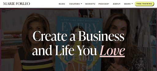
Marie Forleo has a huge YouTube following and is one of the most recognized names in coaching. Our founder Laura Roeder helped create Marie’s B-School, so we’ve been fans for years, alongside big names like Oprah. She does an amazing job positioning herself as a life and business coach.
In our scoring pass she stood out for a single, benefit-led promise (“Create a Business and Life You Love”) paired with an “as seen on” credibility strip and a prominent free training as the low-friction entry point. That’s the formula worth copying: one clear promise plus one easy first step.
Marie is also a master video creator. Her hero image is a clip of her beaming at you, and she repurposes that video content on her blog, which can be powerful for boosting SEO.
5. Denise Duffield-Thomas

Denise Duffield-Thomas has a clear niche: she positions herself as a money mindset coach “for the new wave of entrepreneurs.” If you have a specific niche, make sure it’s obvious the second visitors land on your site.
Another strong point is easy navigation that works like a charm on mobile. It guides the visitor from one section to the next without overwhelming them.
6. Rich Litvin
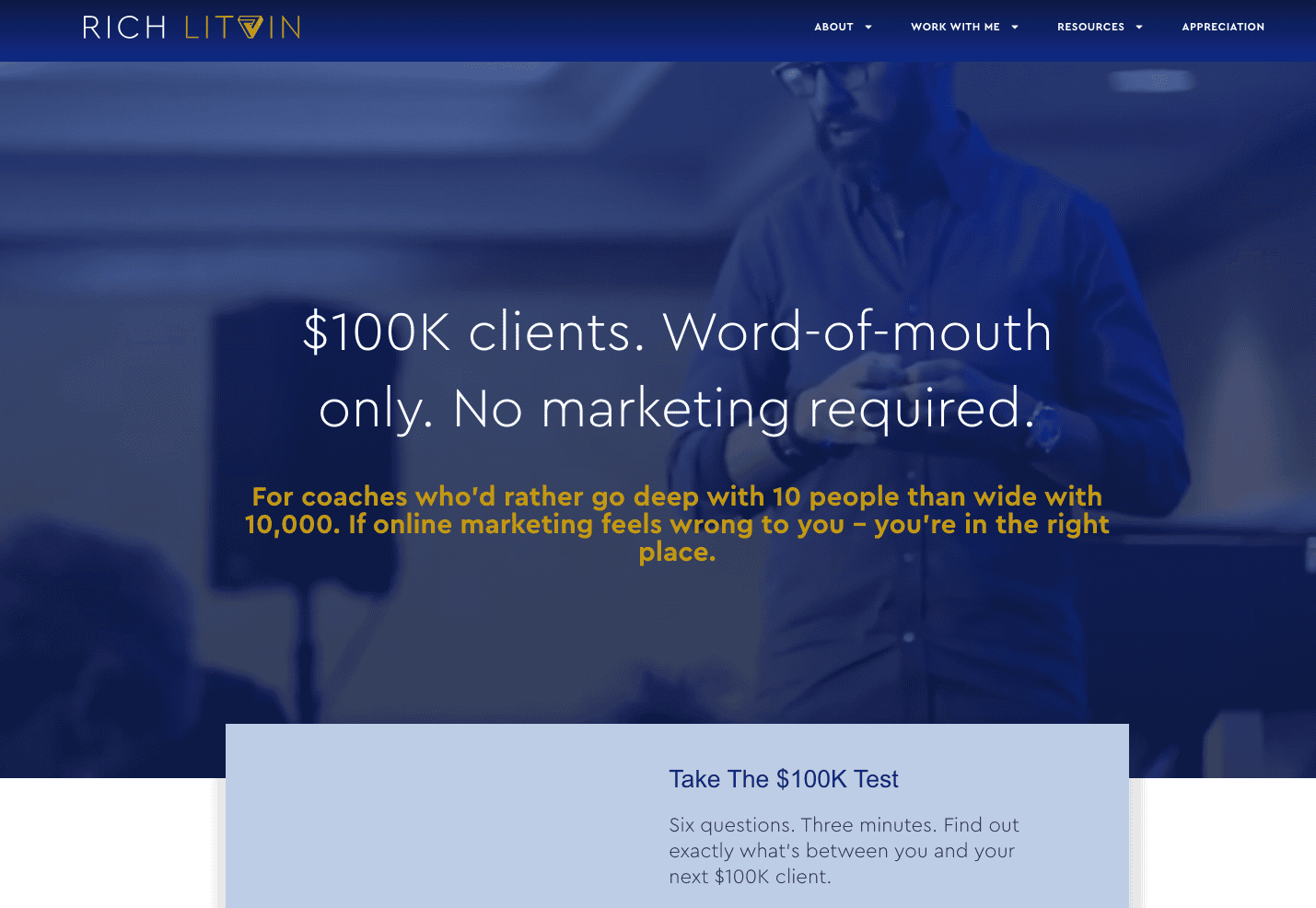
Rich Litvin‘s homepage does something most coaching sites never manage: it says everything that matters in a single line. “$100K clients. Word-of-mouth only. No marketing required.” This names the audience, the outcome, and the mechanism all at once, so a visitor understands who he works with before they’ve scrolled an inch. He reinforces it with a self-qualifying “$100K Test” that lets the right coaches decide for themselves whether they’re ready, quietly filtering his audience before a call ever happens. The takeaway worth stealing: if you can boil your promise down to one sentence a visitor could repeat back to a friend, you’ve cleared the hardest bar in website copy.
7. Hello Seven (Rachel Rodgers)
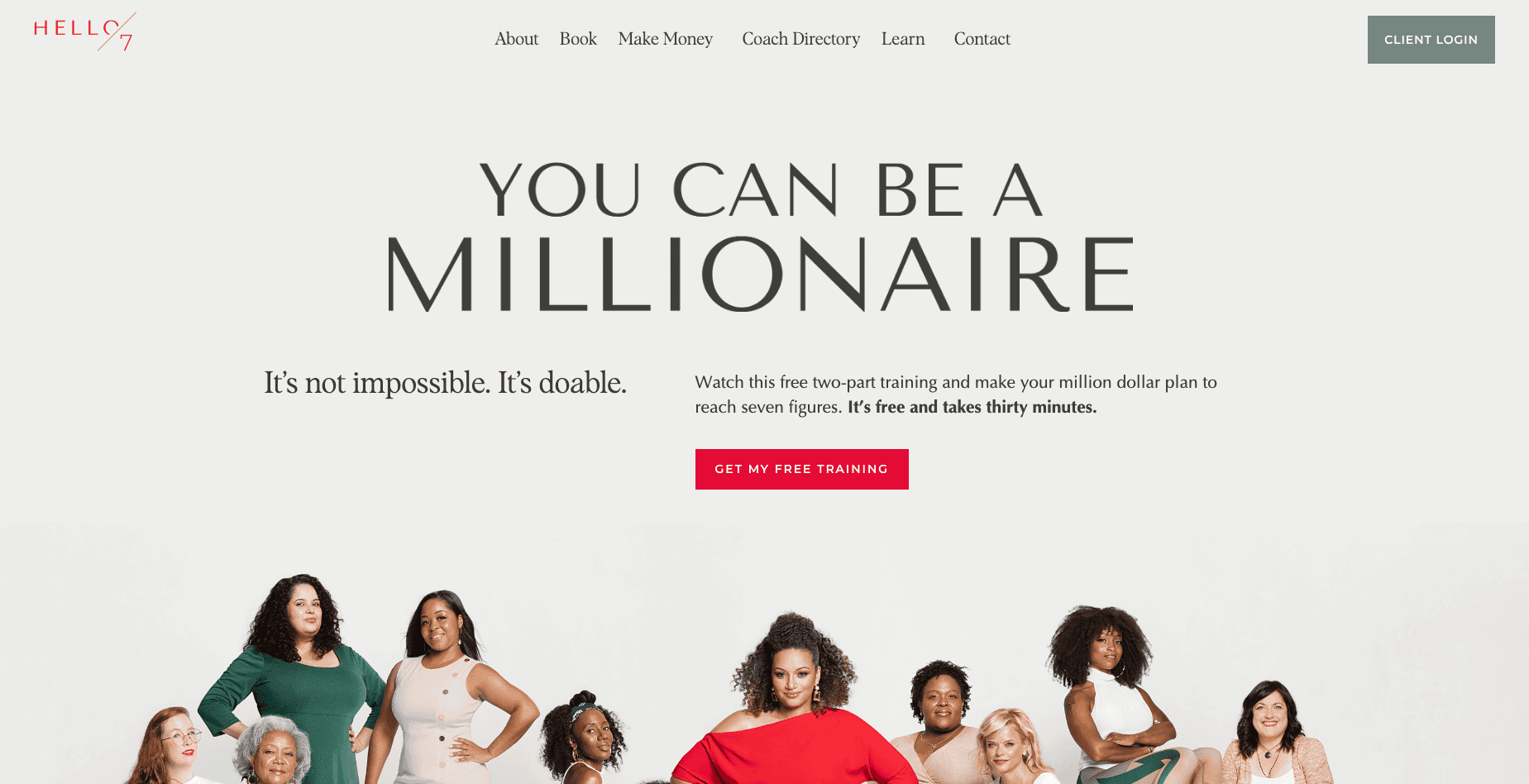
Hello Seven, Rachel Rodgers’ brand, leads with proof that’s hard to argue with: real dollar figures from real clients. Rather than promising to be “transformational,” the homepage stacks concrete result quotes like “I made $100K on the dot in about 10 months” and “We hit $1,000,000 for the first time.” Numbers like those do the persuading that adjectives never can. The site pairs them with clear “Book” and “Get my free training” calls to action, so a convinced visitor always has an obvious next step. The lesson: if your clients get measurable results, put the measurements front and center and let them sell for you.
8. Amy Porterfield
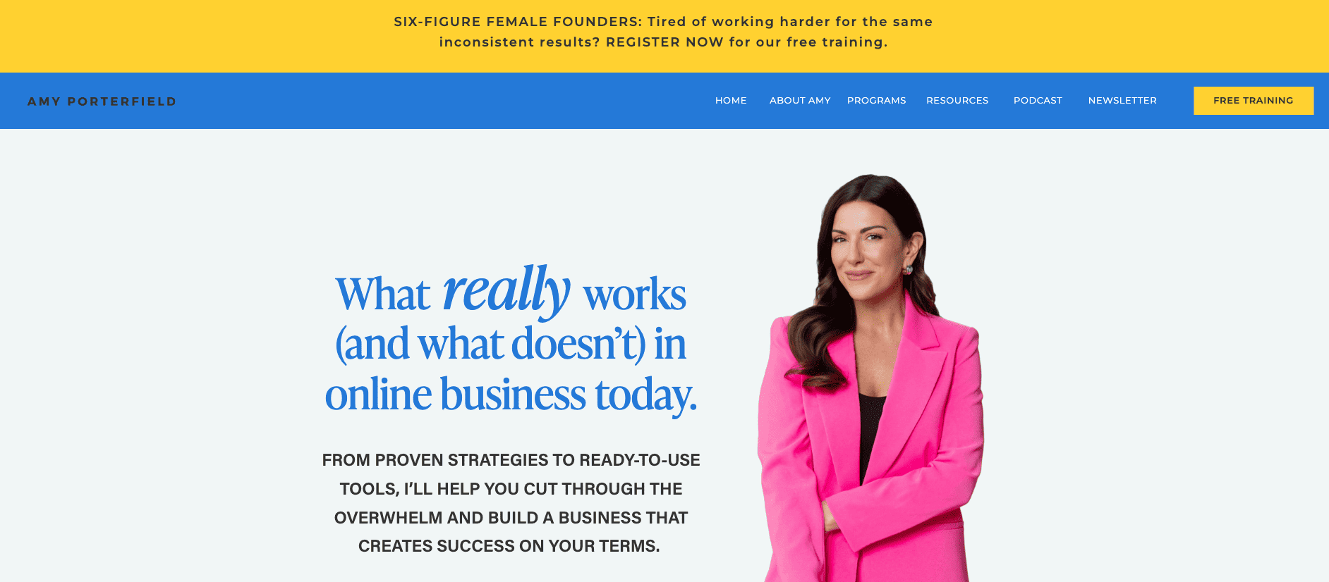
Amy Porterfield‘s homepage opens by describing how the visitor feels before it pitches a thing. “You want freedom, but right now it feels overwhelming and even a little out of reach” mirrors the exact emotion of someone weighing up her programs, and that flash of recognition builds trust fast. Once she’s named the feeling, the proof lands hard: tens of millions of podcast downloads and thousands of students who’ve been through her courses. Naming the problem before offering the solution is a small move most coaches skip, and it’s what makes a reader feel understood rather than sold to.
9. Selena Soo

Selena Soo‘s homepage headline is a question, and that’s exactly why it works: “Are you a hidden gem who dreams of being a household name?” A line like that pulls double duty. It instantly tells her ideal client (an expert who’s brilliant but under-recognized) that they’re in the right place, and it gently waves off everyone who isn’t. Her publicity niche is unmistakable within seconds. If you serve a specific kind of person, a qualifying question in the hero is one of the fastest ways to make the right visitor feel seen and send the wrong one politely on their way.
Want to see how coaches pull this off inside one platform? We put together a set of real Paperbell website examples from working coaches, each built around how they actually coach and want to live.
What’s the Best Website Builder for Coaches? WordPress vs. Squarespace vs. Showit vs. Paperbell
If you’re hunting for the best website builder for coaches, four platforms come up again and again: WordPress, Squarespace, and Showit for a template-and-build-it-yourself approach, or an all-in-one platform like Paperbell if you’d rather skip the builder-plus-tools stack (Paperbell runs $97/month or $970/year, more on that below).
- WordPress
- Squarespace
- Showit
- Paperbell (all-in-one platform)
Prices verified September 2026. Check each builder’s site for current rates.
Here are some of the best themes to build a coaching website on each of the template platforms. Alternatively, you can download our free template pack to make your job easier. If you want a deeper comparison, our roundup of the best WordPress themes for coaches goes platform by platform.

WordPress Themes for Life Coaches
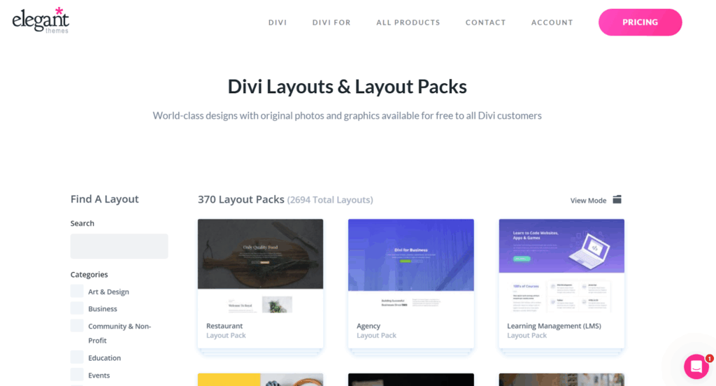
Divi is a WordPress theme that rarely (if ever) requires you to touch code. With affordable yearly and lifetime pricing, you get access to over 100 templates that are easy to customize or mix and match.
Explore Divi’s layout library for WordPress websites here.
Squarespace Templates for Life Coaches
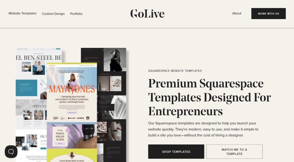
GoLiveHQ is the place to go for Squarespace life coach templates with beautiful designs that adapt easily to your needs. Squarespace is a popular website builder for coaches because it’s genuinely easy to use, and its cheapest plan starts at $25/month (or $19/month if you pay annually), on top of whatever template you choose. If you’re weighing it against a coaching-specific platform, here’s our Squarespace vs Paperbell comparison.
Browse GoLiveHQ’s Squarespace templates here.
Note that some themes aren’t fully accessible, so people with certain disabilities won’t be able to use your site entirely. You’ll need to integrate a third-party tool to ensure Squarespace accessibility.
Showit Templates for Life Coaches
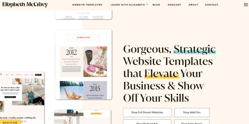
Elizabeth McCravy has many great templates with every page you’d ever need for a fantastic personal website. She also throws in free training when you buy your Showit template.
Browse Elizabeth McCravy’s Showit templates here.
We’re also fans of LovelyImpact, which has a business coaching website template and an executive coaching website template.
Browse LovelyImpact’s coaching website templates here.
Showit runs on its own subscription pricing on top of whichever template you buy, so check its site for current rates before you commit.
One more option to know about: Wix. It’s simpler to set up than WordPress, and the cheapest plan that removes Wix branding and accepts payments (Light) runs at $17.77/month. We didn’t find a dedicated coach-template collection for Wix the way GoLiveHQ and LovelyImpact fill that role for Squarespace and Showit, so you’re mostly customizing Wix’s own templates yourself.
If a simple, high-converting single page is more your speed than a full multi-page site, our guide to the best landing page builders for coaches covers the tools built for exactly that.
The Pages Every Coaching Website Needs
You don’t need a sprawling site to look professional. You just need a handful of pages, each doing one job well. Here’s the core set for a coaching website, with a quick note on what good looks like for each.
- Home page. Your main page makes a clear first impression of your brand and, within seconds, tells visitors who you help and what to do next.
- About page. The place to introduce yourself in more detail: your story, your approach, and why you do this work. People hire coaches they feel they know.
- Services or packages page. Lay out your programs and offers clearly, with context and outcomes, so the right client sees themselves in it.
- Booking page. A frictionless way to schedule a call or session. This is the page that turns interest into a commitment.
- Testimonials page. Named client results and quotes that do your selling for you.
- Contact page. A simple way to reach you for anything that isn’t a booking.
- Frequently asked questions page. Answer the objections and logistics that would otherwise stop someone from reaching out.
- Blog or free resources page. A home for the content that builds trust and helps people find you in search.
- Client portal. Skip the email threads and give clients one place for their assignments, contracts, past payments, and bookings.
Once the essentials are covered, a few optional pages can set you apart as you grow:
- Press page. Feature logos, interviews, and media mentions in one credibility-building spot.
- Speaking page. If you speak at events, give organizers an easy way to see your topics and book you.
- Events calendar. Workshops, group programs, and webinars, all in one view.
- Technical pages. Terms of service and a privacy policy. Not glamorous, but they keep you professional and compliant.
10 Design Principles That Turn Visitors Into Clients
A great coaching website design does more than look pretty. It shows your expertise and makes it easy for the right clients to say yes. Here are the 10 principles that separate strong sites from the forgettable ones.
- Clear messaging. Visitors should instantly understand what you offer and who it’s for. A simple tagline like “Leadership coaching for teams that thrive” beats a clever line that says nothing. If you’re stuck, these 60+ life coaching tagline examples (and how to write your own) will help.
- Professional branding. Consistent colors, fonts, and imagery that match the feeling you want clients to have. Cohesion reads as competence.
- Engaging, professional photos. Your visitors want to put a face to who they’ll be working with. Skip the fancy studio shots if they don’t feel like you, and pick images that actually show your personality, whether that’s warmth, energy, or calm. It’s worth hiring a photographer who understands lighting.
- Easy navigation. A visitor should never wonder where to go next. Keep the menu short and the path obvious.
- Mobile-friendly design. A big chunk of your traffic is on a phone. If the site is hard to use there, you lose them. All 19 sites we scored had this covered, and so should you.
- Call-to-action buttons. Don’t make visitors guess what to do next. Guide them with clear prompts like “Book Your Free Call” or “Get Started Today,” and repeat the button as they scroll. Put one in the hero section so ready visitors don’t have to hunt.
- Client testimonials and case studies. Social proof builds trust faster than anything you say about yourself. Add testimonials, credentials, and real results throughout.
- A simple booking system. A smooth booking flow lets clients schedule and pay on the spot instead of trading emails. A tool like Paperbell handles bookings, contracts, and payments in one place.
- Free resources. A blog, podcast, or downloadable guide builds a relationship before anyone books. It makes your marketing easier because people already know, like, and trust you. Need ideas? This roundup of the best life coach blogs is a great place to start.
- Clear services and secure payments. Spell out what clients get, what’s included beyond sessions, and the outcomes they can expect. Then make paying safe and simple. Some coaches share starting rates upfront while others explain pricing on a call. Both work, so test what fits your audience.
Judgments about a site’s credibility are heavily driven by how it looks, so these design choices carry real weight. Getting them right is what makes a first-time visitor trust you enough to reach out.
How to Build Your Coaching Website Without Code
Here’s the good news for anyone who breaks into a sweat at the word “developer”: you do not need to write code, and you don’t need to hire someone to write it for you. Modern no-code platforms produce sites that are indistinguishable from expensive custom builds.
The first decision is do-it-yourself versus done-for-you. Hiring a designer gets you something bespoke, but it’s the pricier, slower route, and you’re often left managing separate tools for booking and payments afterward. Building it yourself on a template or an all-in-one platform is faster, cheaper, and completely in your control. For most coaches starting out (or refreshing an outdated site), the do-it-yourself route wins.
The second decision is template versus all-in-one. A template on WordPress, Squarespace, or Showit gives you a beautiful shell, and you add booking and payment tools separately. An all-in-one platform like Paperbell gives you the website plus the booking, payments, and client management already built in. If you want the whole client journey handled in one place, that’s the fastest path.
Building Your Coaching Website Inside Paperbell
A coaching website does the real work: people find you through it, figure out what you offer, and decide whether to reach out. Building one from scratch is usually the slow, technical part that stops coaches from starting at all.
Paperbell skips that step. Instead of a blank canvas, you get a ready-made, client-facing website with booking and payment already built in. Here’s roughly how coaches set one up.
1. Create your account (free to start, no card required). Sign up and you land in your dashboard, where you’ll set up your packages, availability, and website content.
2. Add your coaching packages. Create your offers as one-off sessions, packages, group programs, or subscriptions. You can present clear coaching packages with context, timelines, and pricing, and keep some packages public and others private.
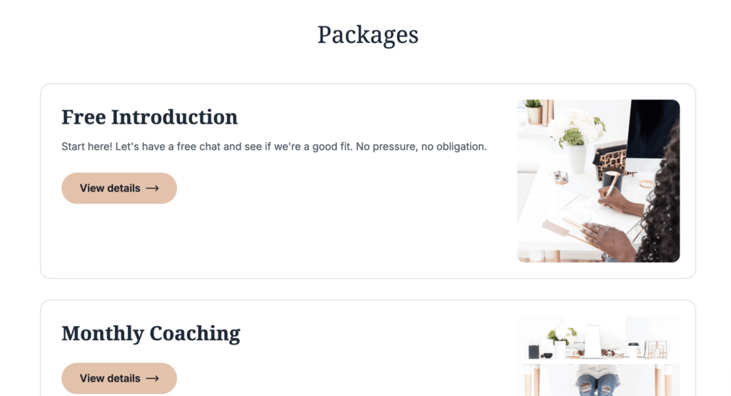
3. Write and style your content. Add your hero section introducing you and your coaching services, your testimonials, a frequently asked questions block, and your call to action. Adjust the colors, fonts, and logo to match your brand.

4. Add an email opt-in. The built-in opt-in form lets you collect email addresses from visitors who aren’t ready to book yet, so you can stay in touch and grow your list. Be sure to share what they’ll get if they sign up.
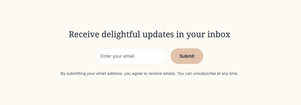
You can export that list anytime and import it into your preferred email marketing platform for newsletters and updates.
5. Connect scheduling and payments. Sync your Google, Outlook, or Apple calendar so clients only see times you’re actually free, and connect your payment provider so they can book, pay, and sign their contract in one flow. Time zones are handled automatically, and you can set an appointment gap between sessions in your settings.
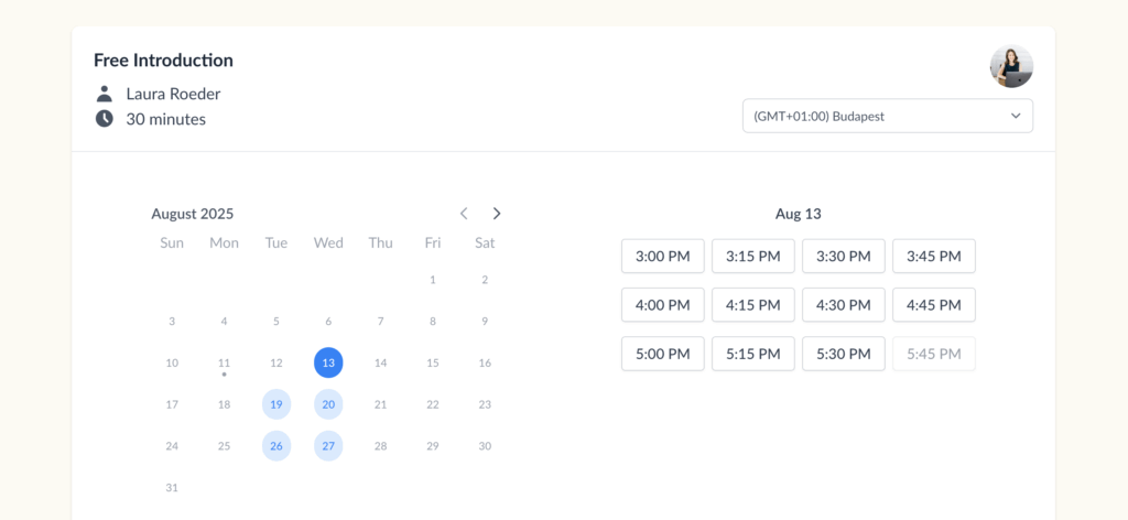
When a client is ready to schedule their first discovery session or buy a package, they complete their payment and sign the contract the same way, without you lifting a finger.
6. Publish and share. Preview your site, then publish it at your own Paperbell web address (like paperbell.me/yourname) or use a custom domain. Some coaches use Paperbell as their entire website. Others link to it from Instagram, Substack, or a website they built outside of Paperbell.
On cost: a fully custom, designer-built site runs into the thousands and usually needs separate subscriptions for booking and payments on top. Paperbell is a flat $97 per month, or $970 per year, with the website and all the client-management tools included. For most coaches, that math is easy.
Want proof? Take a look at these real Paperbell website examples from working coaches who run their whole practice this way.
Ready to see it for yourself? Try Paperbell for free and build your coaching website in an afternoon.
A Niche Example: Spiritual Coaching Websites
The principles above apply to any coaching niche, but a great site always feels tailored to its specific audience. Spiritual coaching is a good example of getting that right.
Here’s how you stand out as a spiritual coach: find the one thing that’s genuinely yours and can’t be copied by every other spiritual coach out there. That could be your own framework or process, a specific type of person you help, or the way your own life experience shapes how you guide clients.
Whatever that differentiator is, pair it with one clear next step so the visitors who connect with your approach can act on it right away. The strongest spiritual-coaching sites lead with a distinct point of view, then funnel everything toward a single, obvious booking button. Niche personality and a frictionless path to book work best together.
Frequently Asked Questions
How much does a coaching website cost?
It depends on how you build it. A custom, designer-built site can run into the thousands, plus separate subscriptions for booking and payment tools. Templates on WordPress, Squarespace, or Showit are cheaper but you still add those tools yourself. An all-in-one platform like Paperbell is a flat $97 per month (or $970 per year) with the website and client-management tools included.
Do I need a website to get coaching clients?
Not strictly, but it helps a lot. Plenty of coaches start with referrals and social media, yet a website is where a curious prospect goes to decide if you’re the real deal. It works around the clock to explain your offer, show proof, and let people book, even while you’re coaching or asleep.
What’s the best platform for a coaching website?
The best platform is the one that matches how technical you want to get. Squarespace and Showit are great for a polished design-first site, WordPress offers the most flexibility, and an all-in-one tool like Paperbell is the fastest option because booking, payments, and client management are already built in.
Should I build my coaching website myself or hire someone?
Most coaches should build it themselves, at least to start. Modern no-code tools produce professional results without any coding, and doing it yourself is faster, cheaper, and easier to update. Hiring a designer makes sense once you’re established and want something fully bespoke.
How many pages does a coaching website need?
Fewer than you’d think. A home page, an about page, a services or packages page, a booking page, and a testimonials or contact page cover the essentials. You can add a blog, a frequently asked questions page, and a client portal as you grow. Quality beats quantity every time.
What should be on a life coach homepage?
Within seconds, your homepage should tell visitors who you help and what changes for them, then give them one obvious next step like booking a call. Add social proof (testimonials or client results), a clear look at your services, and an email opt-in for people who aren’t ready yet. When we scored 19 real coaching sites, the strongest ones did exactly this.
Can I build a coaching website without knowing how to code?
Absolutely. You never have to touch code. Website builders and all-in-one coaching platforms are designed for non-technical users, and the results look every bit as good as a custom-built site. If you can post a photo on Instagram, you can set up a coaching website.
Build a Coaching Website You’re Proud Of
Setting up an effective coaching website doesn’t have to be complicated. Use the scorecard to spot your weak points, borrow the moves from the examples that scored well, and build the handful of pages that actually matter.
And you don’t have to piece it together from five different tools. Paperbell gives you a client-ready website plus booking, payments, contracts, and a client portal in one place, so you can spend your time coaching instead of tinkering with web builders.
Try Paperbell for free and launch your coaching website in an afternoon.